The challenge
Redesign for a more modern, responsive, consistent experience.
The app I was working on was not based on an established design system or even a comprehensive stye guide. This of course resulted in a wide range of inconsistencies. It was also part of an acquisition and the ui needed to better align with brand. In addition, the ui needed to be more responsive and flexible to better support future localization efforts.
Redesign/Design System
Key Goals & Requirements
Supports localization
Works across various devices
Feels on brand
Create reusable components
Initial Discovery
The first thing I did was conduct a product style inventory looking at every individual item from drop downs, to cards, to radio buttons. Every component and how/where they were being used. I looked at my product, other company products and the marketing site. I compared branding elements like iconography, colors, buttons, etc. to see how we could better align and make a more cohesive experience for users.

I knew once we got to the development stage I'd want to begin at the component level so started creating shell pages for every component we would need. Before I finalize any component I like to experiment with various designs first to ensure that it works throughout the application and/or across products.
D&B Hoovers Design System
The scope of this project was largely focused on redesigning the ui from a visual standpoint vs a functional redesign. Product owners did not want users to have to relearn a completely new interface. Where it made sense I was able to add some small ux improvements here and there but this was mainly a visual redesign. 

Company Summary

before
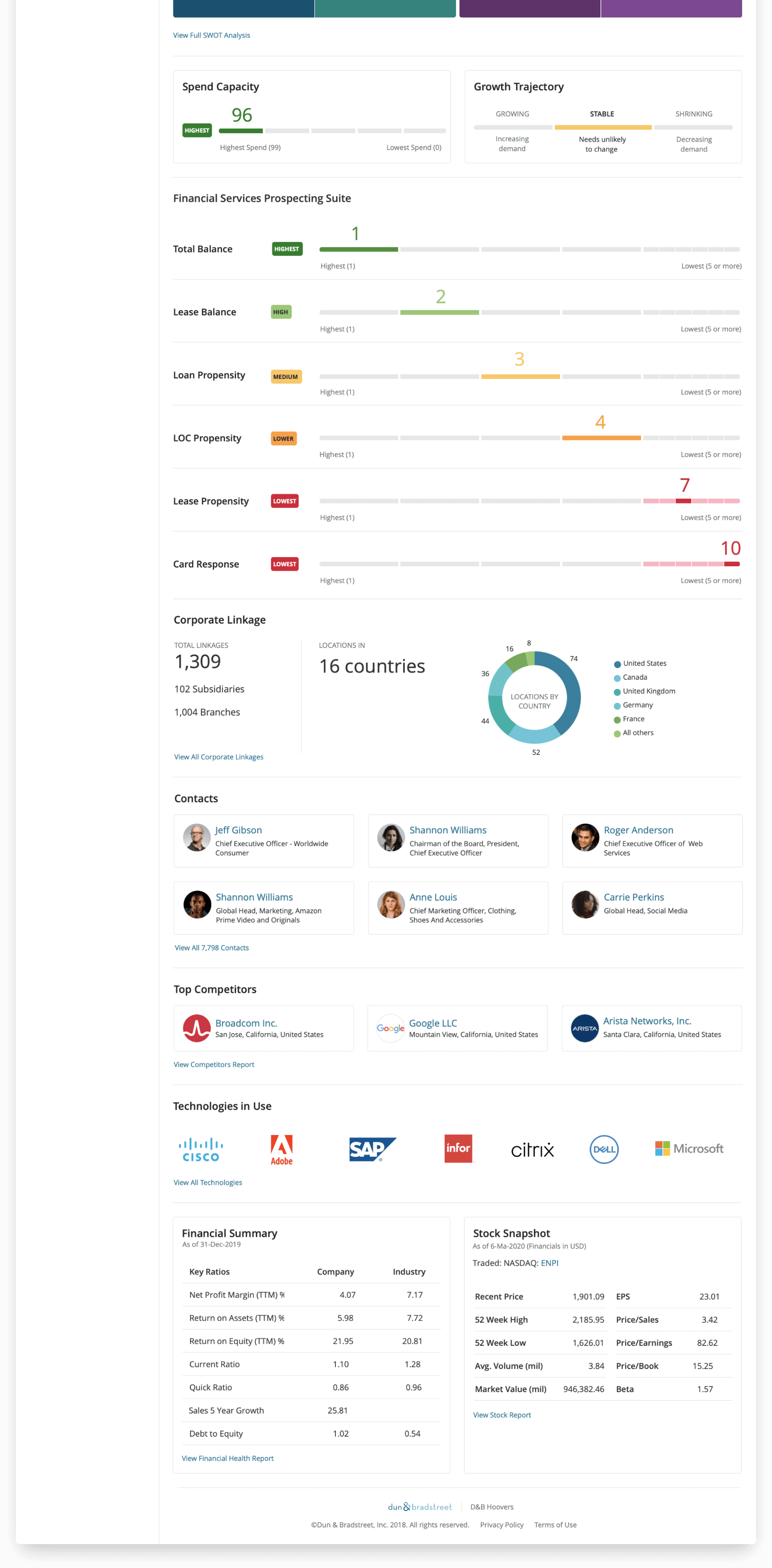
The old version used very small text making it somewhat difficult to locate and read important information. The double stacked sticky header, along with other locked header patterns throughout the app, used a lot of vertical real estate and limited users view of the main content, particularly for those using it within Salesforce which also has a sticky header.
After
The new design uses a prominent single line header to help offset it from the main content areas, and disappears when the user scrolls down, but quickly reappears when the user begins to scroll back up. The left navigation panel is no longer pushed below a bulky header area reducing some amount of scrolling, and is also collapsable to maximize vertical space when viewing on smaller screens. Key information is displayed in large prominent fonts making it easier to locate.
D&B Hoovers Redesign

Search Results

before
The search results header in the old ui was somewhat cluttered. The button labels were somewhat confusing for new users who might not understand what "Saving as a SmartList" does and may not have an existing list to add to. The "Save This Search" CTA wasn't very noticeable.
After
While largely similar, the new design offers a much cleaner header. It now has a clear primary action along with secondary actions. The multiple buttons for creating lists has been replaced with a singular button with clearly labeled drop downs. The CTA for saving the search is now much more prominent and is closely associated with the search criteria. The results themselves now better utilize the available vertical space.
D&B Hoovers Redesign

Lists

before
In the old ui it was difficult to distinguish one list from another. Not much was presented to help a user quickly scan for the list they were looking for.
After
Adding horizontal tabs for each list type serves two purposes. One, the tabs help the user to more easily hone in on the list they're looking, and two, this also provides an opportunity to create informative empty states that can help educate a new user on the distinctions between list types.

Since lists can contain a variety data types, using iconography that represents the content, makes it easier to scan and quickly identify the specific list they're looking for.
D&B Hoovers Redesign

General Administration

before
For site administrators in order to access various administrative pages, they had to navigate to the gear icon and select individual pages. This was somewhat cumbersome and inefficient.
After
By simply adding a left nav to house all administrative pages and then grouping related pages accordingly, this made it much easier to quickly navigate between pages.
D&B Hoovers Redesign
We wanted to release the new ui in phases and offer the option to switch back and forth as needed. As of now, of the users that have switched to the new ui, 87% have stayed despite the many lingering bugs.
D&B Hoovers Redesign